You are using an unsupported browser. Please upgrade your browser to improve your experience. (close)
Photography
Our photography is honest.
Product is beautiful and believable.
People are authentic, relatable.
Our photo style is evolving with trend, innovating on subtle details like lighting, shadow, angle and composition while creating a brand-consistent look.
The goal: every photo and video is identifiably Starbucks. Product stories are clearly about the product. We use people sparingly, thoughtfully and with intention.
Product Photography
Photography lives in a modular system where products can be easily swapped.
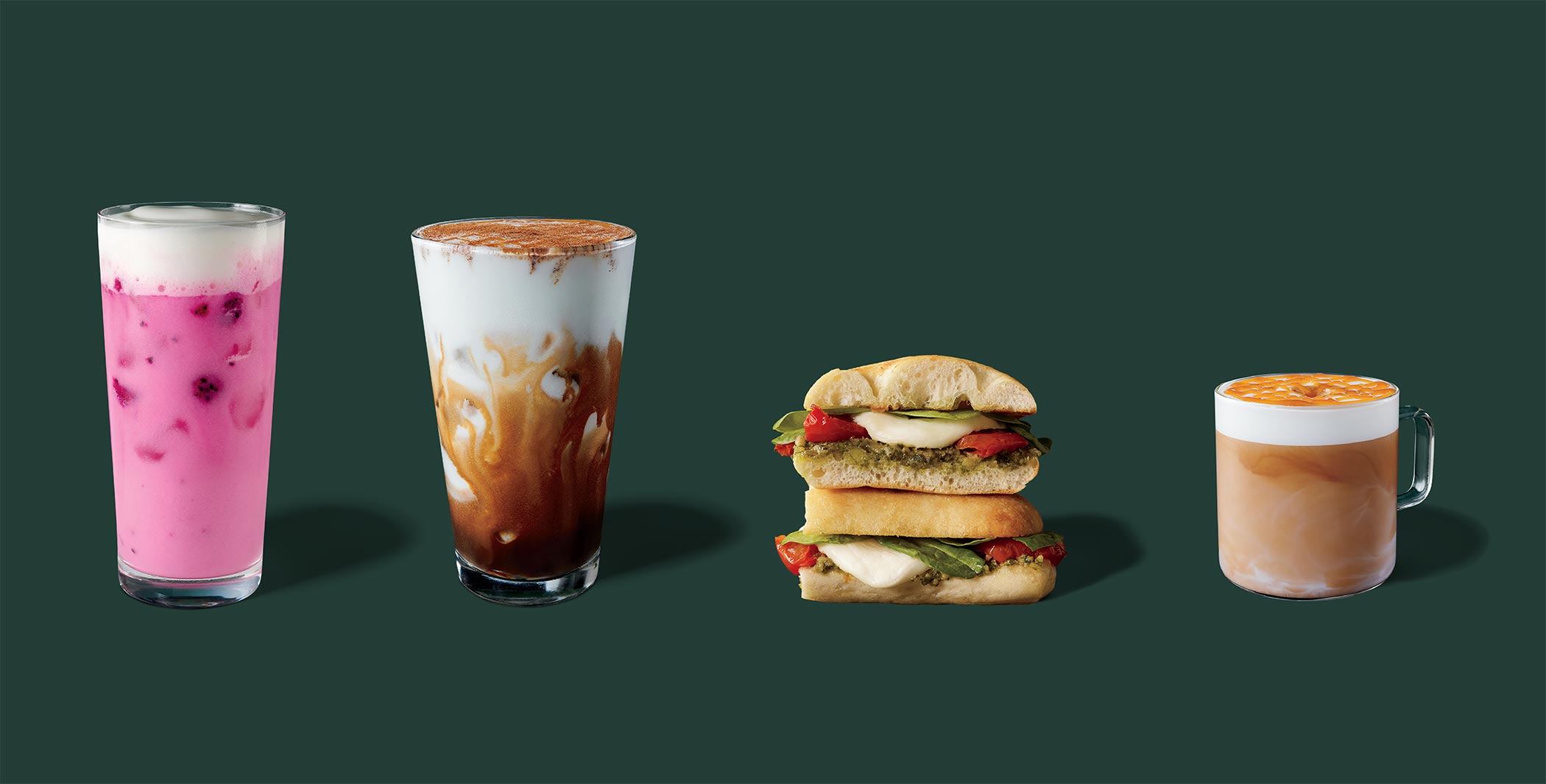
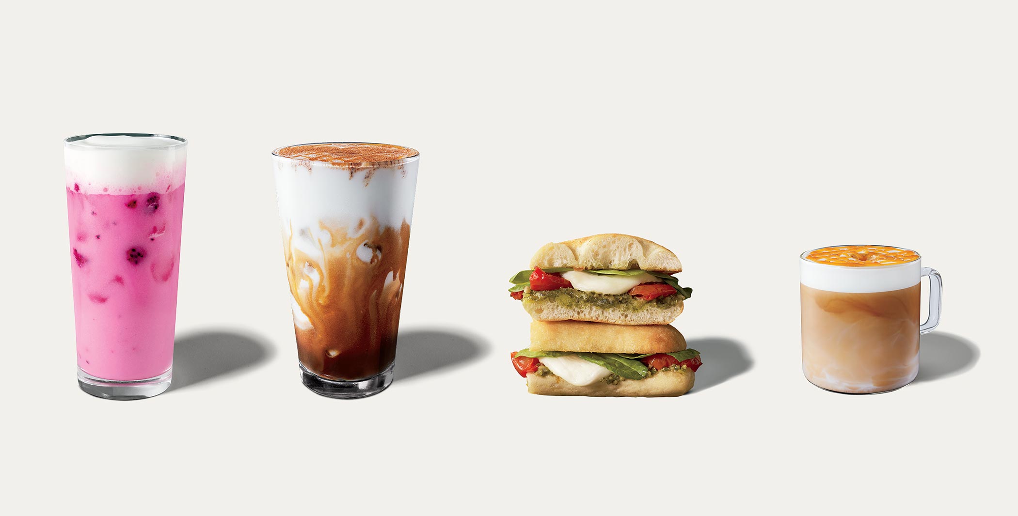


Where We Use It:
- Menus
- Digital Communication
- Promotional Signage
- Digital Communication
- Advertising
- Social
Glassware
Glassware shouldn’t be distracting. We use consistent forms: a pint glass for most cold beverages and a modern glass mug for hot beverages.
Iced teas, Starbucks Refreshers® iced beverages and other non-coffee cold drinks can be shown in a tall, narrower glass.
Shadows
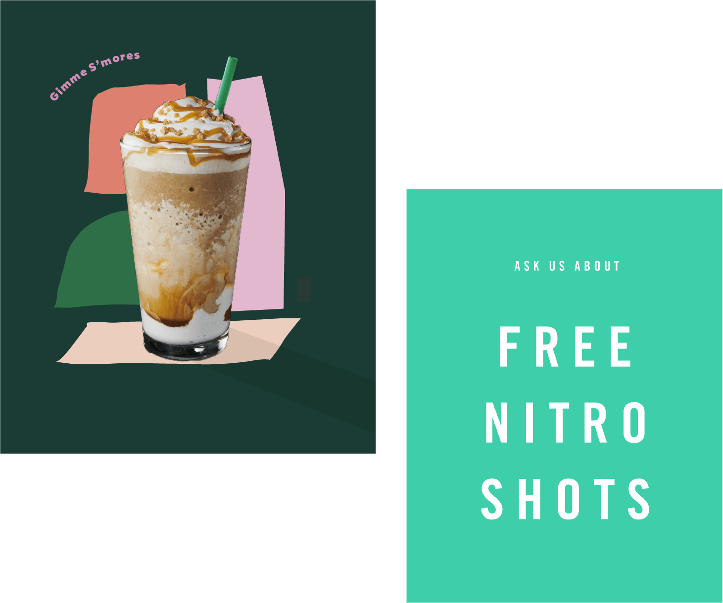
Use graphic shadows to add interest to compositions.
Styling
Shots should convey a handcrafted quality with a refined / clean / graphic composition.
Highlight crafted details like dustings of cinnamon and dark crema moving through foam.
Whip should be styled in a way that is less decadent and dessertlike, more handcrafted. Shots and composition should highlight ingredients wherever possible.
Food should have a human-centric quality, styled with slight imperfections that amp up realism and appetite appeal. However, we stay away from showing bites, crumbs, loose ingredients and packaging.
Editorial Photography
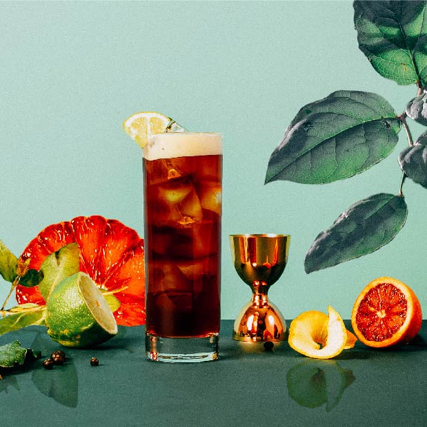
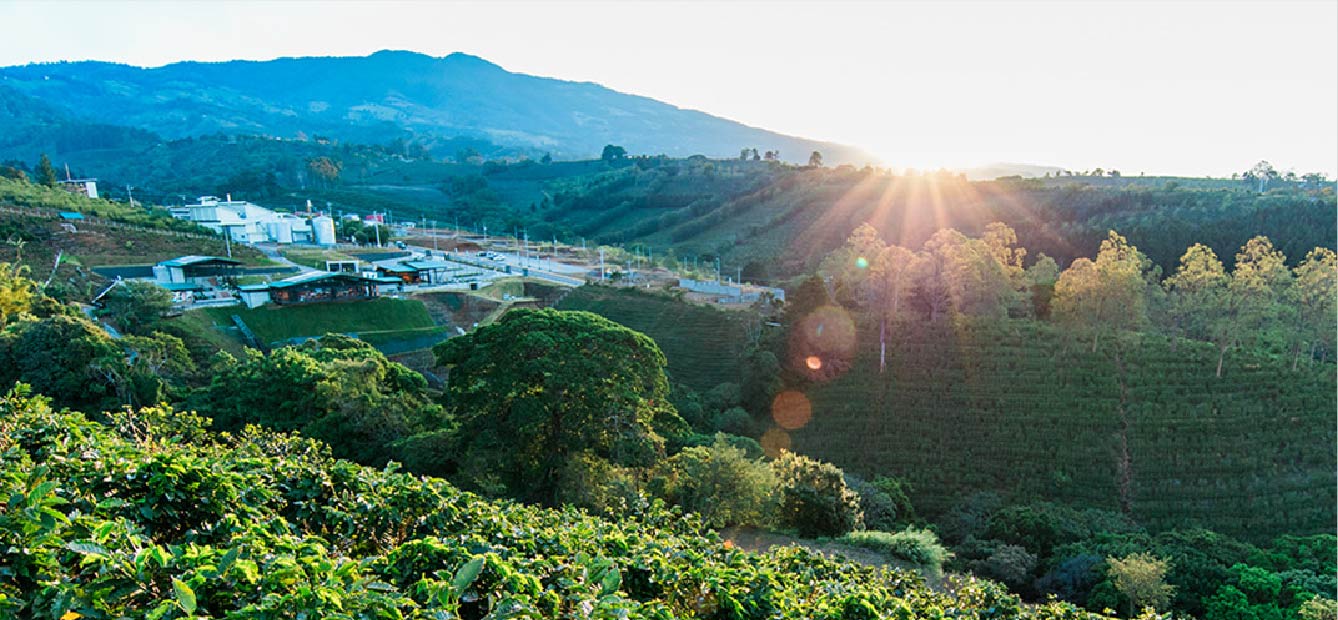

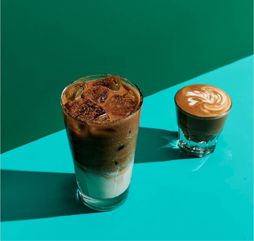
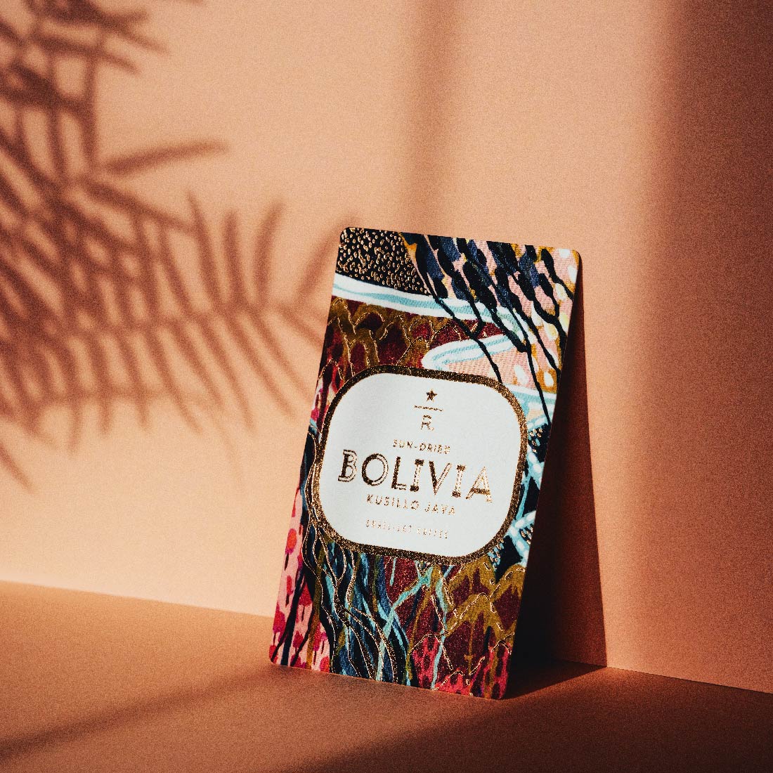
Where We Use It:
- Partner Stories
- Barista Craft
- Brand Stories
- Farmer Stories
- Social Impact Stories
- Public Affairs Use
- Social
Studio
Studio photography should feel artful, editorial and intentional. Any props and styling should complement the focal point, not overshadow it. Soft, directional and warm light creates a real, craveable and elevated moment.
Environmental
Whether it’s via a friendly face, an aspirational moment or a snippet of a scene that leaves you wanting more, environmental photography should connect with our audience. This is attainable cool—it looks like it could be you.
